Wednesday, February 26, 2014

Horizontal Spry Menu Bar in Dreamweaver


Text Book:
http://proquestcombo.safaribooksonline.com/book/web-design-and-development/9780321718143/building-pages-with-dynamic-elements/ch14lev1sec1

http://proquestcombo.safaribooksonline.com/book/web-design-and-development/9780133006018/firstchapter#X2ludGVybmFsX0ZsYXNoUmVhZGVyP3htbGlkPTk3ODAxMzMwMDYwMTglMkZhcHAwNXNlYzFsZXYx


Change The Cell Width of Spry Menu Bar

Social Widget

FACEBOOK: http://developers.facebook.com/docs/plugins/

-----------------------------------------------------------

10 Widgets to Make Your Website More Social

Everybody loves web widgets: mini web applications that can be embedded almost anywhere. But with so many widgets out there, it's hard to know which will enhance your website and engage your audience. Below are some of the most popular and social widgets available.
Note: Embedding a widget involves 'cut, copy, and paste' functions and a website that allows you to embed HTML code. If you are using HostBaby's Site Builder, you can embed any of these widgets in your widget sidebar or directly on a page.

Facebook's Like Button

The Like allows your visitors to see how many people "Like" you page. When clicked, it also sends a status update to the visitors' Facebook page so their friends can see what they 'Liked.' This is a great and easy way to increase your visibility on Facebook. You can set up the Facebook "Like" button here.

Twitter Widgets

Twitter offers 4 widgets you can put on your website. The Profile Widget Displays your most recent Twitter updates, the Search Widget displays the twitter search results of your choosing, the Favs widget shows off your favorite tweets and the List Widget allows you to put your favorite Twitter users in a single feed. You can set up any of the four here.

Widgetbox RSS Widget

This Widget allows you to syndicate any blog feed right on your website. This could be your blog or simply a blog that you think your visitors will enjoy. This is a great way to constantly refresh your site with new content without lifting a finger.Build a RSS Widget here.

Google +1

Adding a +1 button allows your fans to give you a boost in search ranking (the boost is mostly noticible within the visitors' Google network of friends, but that's not a bad thing). Clicking the +1 also updates your Google+ status. You can get theGoogle +1 button here.

StumbleUpon Badge

Tap into a the rabid and numerous StumbleUpon users by encouraging them to 'like" your page. The more people that like it, the more people will see it.StumbleUpon serves up random webpages based on user preferences. Warning: It's very addictive. StumbleUpon Badge
StumbleUpon also just added a new widget that will showcase your favorite 'stumbled' websites. You can get that here.

Flickr Slideshow

If you use Flickr (or even if you don't) you can embed any Flickr slideshow on your site. Simply navigate to the Flickr slideshow you want to embed, click the share menu. From there, grab the embed code or click "customize this HTML" if you want to specify the size of your slideshow. Grab the code and drop it into your website.

YouTube Videos

Never underestimate the power of video to make your website come alive. Sharing YouTube videos on your website will increase your views and hopefully your video "likes". Don't forget to encourage people to subscribe to your YouTube channel. In  order to embed a YouTube video on your site, simply click the 'share' button located below the YouTube video in question and then click "embed." Copy the code and then paste it on the page you want the video to appear.

CSS Gradient Generator

http://gradients.glrzad.com

CSS3: Hover Effect & More Templates

http://blog.templatemonster.com/2011/12/22/css3-hover-effect-tutorials/

http://tympanus.net/codrops/2011/11/02/original-hover-effects-with-css3/

http://tympanus.net/Tutorials/OriginalHoverEffects/

http://tympanus.net/codrops/2013/07/16/on-scroll-header-effects/

More about WEB effect and tutorials:
http://tympanus.net/codrops/category/tutorials/

Menu bar

Centered Menu Basic Example

CSS Centered Menu

Navigation Bar (w3school)

Centering a horizontal spry menu

Customize spry menu

css menu maker

CSS Menu Maker


Web Colors

http://mudcu.be/sphere/source/


Web Inspector

Enabling Web Inspector

To start using Web Inspector, you must first enable the Develop menu. To do so, enable the “Show Develop menu in menu bar” setting found in Safari’s preferences under the Advanced pane, as shown in Figure 1-1.
Figure 1-1  The Advanced pane of Safari’s preferences
You can then access Web Inspector through the Develop menu that appears in the menubar, or by pressing Command-Option-I. You can also add the Web Inspector toolbar item to Safari’s toolbar by selecting View > Customize Toolbar.


Figure 1-2  The Web Inspector toolbar item

Monday, February 24, 2014

CSS3 Effects and template

CSS3: Hover Effect & More Templates

http://blog.templatemonster.com/2011/12/22/css3-hover-effect-tutorials/

http://tympanus.net/codrops/2011/11/02/original-hover-effects-with-css3/
http://tympanus.net/Tutorials/OriginalHoverEffects/


http://tympanus.net/codrops/2013/07/16/on-scroll-header-effects/

More about WEB effect and tutorials:
http://tympanus.net/codrops/category/tutorials/

CSS3: Columns, Overflow, Transition

Multiple Columns
http://www.w3schools.com/css/css3_multiple_columns.asp

Overflow
http://www.w3schools.com/cssref/pr_pos_overflow.asp

Transition Property
http://www.w3schools.com/cssref/css3_pr_transition.asp

Menu: HTML5 & CSS3

http://www.smashingapps.com/2013/02/18/48-free-dropdown-menu-in-html5-and-css3.html

http://www.antsmagazine.com/web-development/40-free-dropdown-menus-in-html5-and-css3/

http://www.html5xcss3.com/p/responsive-menus-tutorials.html

http://tympanus.net/codrops/2013/07/30/google-nexus-website-menu/

Widget Browser: LightBox 2 and Template

Serendipity – Free Responsive HTML Template

Today we give away the HTML version of our fully responsive premium WordPress theme Serendipity.
(Free for only personal use.)
If you are not feeling good about HTML and would like to have the theme with an admin panel along with gallery featuring Tumblr-like lightbox, working contact form and font/color/background options, WordPress version of Serendipity is what you are looking for.

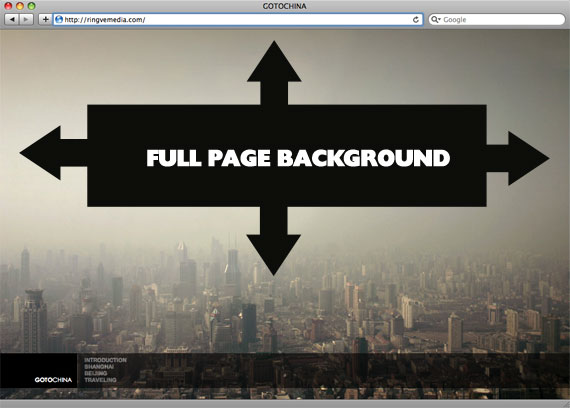
Full Page Background


http://css-tricks.com/perfect-full-page-background-image/

CSS-Only Technique #2

One rather simple way to handle this is to put an inline image on the page, fixed position it to the upper left, and give it a min-width and min-height of 100%, preserving it's aspect ratio.
<img src="images/bg.jpg" id="bg" alt="">
#bg {
position: fixed;
top: 0;
left: 0;

/* Preserve aspet ratio */
min-width: 100%;
min-height: 100%;
}
However, this doesn't center the image and that's a pretty common desire here... So, we can fix that by wrapping the image in a div. That div we'll make twice as big as the browser window. Then the image will be placed, still preserving it's aspect ratio and covering the visible browser window, and the dead center of that.
<div id="bg">
<img src="images/bg.jpg" alt="">
</div>
#bg {
position: fixed;
top: -50%;
left: -50%;
width: 200%;
height: 200%;
}
#bg img {
position: absolute;
top: 0;
left: 0;
right: 0;
bottom: 0;
margin: auto;
min-width: 50%;
min-height: 50%;
}
Credit to Corey Worrell for the concept on this one.
Works in:
  • Safari / Chrome / Firefox (didn't test very far back, but recent versions are fine)
  • IE 8+
  • Opera (any version) and IE both fail in the same way (wrongly positioned, not sure why)
  • Peter VanWylen wrote in to say that if you add the image via JavaScript, the img needs to have width: auto; and height: auto; to work in IE 8, 9, or 10.

Grid Layout


GRID LAYOUT:
http://educ.jmu.edu/~shinjb/forclass/ch15/liquid-layout.html

FLOAT:
http://educ.jmu.edu/~shinjb/forclass/ch15/float.html

css: positioning, z-index

http://www.w3schools.com/css/css_positioning.asp
http://www.w3schools.com/cssref/pr_pos_z-index.asp
https://developer.mozilla.org/en-US/docs/CSS/position
http://www.alistapart.com/articles/css-positioning-101/


Relative positioning
To position an element relatively 20px from the top and left of its normal position, the following CSS is used.
#two { position: relative; top: 20px; left: 20px; }
Note how the other elements are displayed as if "Two" were in its normal position and taking up space.

Absolute positioning

Elements that are positioned relatively are still considered to be in the normal flow of elements in the document.  In contrast, an element that is positioned absolutely is taken out of the flow and thus takes up no space when placing other elements.  The absolutely positioned element is positioned relative to nearest positioned ancestor.  If a positioned ancestor doesn't exist, the initial container is used.
In the example below, the blue ancestor div is positioned relative (so it becomes the nearest positioned ancestor) and box Two is positioned absolutely:
#ancestor { position: relative; background: #ddf; width: 500px; }
#two { position: absolute; top: 20px; left: 20px; }

If #ancestor had not been positioned relative, box Two would have appeared relative to the upper left corner of the page.

Fixed positioning

Fixed positioning is similar to absolute positioning, with the exception that the element's containing block is the viewport.  This is often used to create a floating element that stays in the same position even after scrolling the page.  In the example below the "One" box is fixed 80px from the top of the page and 20px from the left:
#one { position: fixed; top: 80px; left: 20px }
When viewing the top of the page, the position box appears in the upper left, and after scrolling, it remains in the same place relative to the viewport:
fixed-1.png
fixed-2.png


http://css-tricks.com/video-screencasts/110-quick-overview-of-css-position-values/


Wednesday, February 19, 2014

div, id, and class

HTML <div> Tag:

The <div> tag defines a division or a section in an HTML document.
The <div> tag is used to group block-elements to format them with CSS.
http://www.w3schools.com/tags/tag_div.asp


CSS Id and Class:
id Selector
The id selector is used to specify a style for a single, unique element.
The id selector uses the id attribute of the HTML element, and is defined with a "#".

class Selector
The class selector is used to specify a style for a group of elements. Unlike the id selector, the class selector is most often used on several elements.
This allows you to set a particular style for many HTML elements with the same class.
The class selector uses the HTML class attribute, and is defined with a "."

http://www.w3schools.com/css/css_id_class.asp

Monday, February 10, 2014

Inspiration

Web Design
http://www.siteinspire.com

http://inspiration.ivomynttinen.com

Code Editor
http://codepen.io/

CSS (Internal & External)

INTERNAL CSS

<!DOCTYPE html>
<head>
<title>using INTERNAL css</title>
<style type="text/css">
body {
font: 100%/1.4 Verdana, Arial, Helvetica, sans-serif;
background-color: #42413C;
}
</style>
</head>

<body>
</body>
</html>


EXTERNAL CSS

<!DOCTYPE html>
<head>
<title>using EXTERNAL css</title>
<link href="css/style.css" type="text/css" rel="stylesheet"/>
</head>

<body>
</body>
</html>

-------
style.css

body {
font: 100%/1.4 Verdana, Arial, Helvetica, sans-serif;
background-color: #42413C;
Internal & External CSS }

Museums & Galleries

http://www.musee-orsay.fr/en/home.html

  • MMK Frankfurt am Main | Museum für Moderne Kunst
  • bauhaus-archiv museum of design
  • Vitra Design Museum_Germany
  • 010101 : Art in Technological Times
  • The Chicago Athenaeum
  • Welcome to the British Museum
  • Tate Online: British and international modern and contemporary art
  • The National Gallery, London
  • db artmag - all the news on Deutsche Bank Art / db artmag - alle Infos zur Kunst der Deutschen Bank
  • Deutsche Guggenheim_Berlin
  • Museum of London - Home
  • Royal College of Art_Show
  • welcome to Musée d'Orsay (english version)
  • Museen Basel_list
  • Type Museum
  • Typemuseum
  • National Museum of Science and Technology
  • MoCo Tokyo - Modern contemporary design & architecture
  • MUSEUM INFORMATION JAPAN
  • ICC
  • Cooper-Hewitt, National Design Museum | Home
  • National Academy Museum and School of Fine Arts
  • Uffizi / Polo Museale Fiorentino
  • The State Hermitage Museum
  • Museo del Prado
  • Fine Arts Museums of San Francisco - de Young - Legion of Honor
  • Harvard University Art Museums
  • MIT MUSEUM
  • Peabody Museum / Yale University
  • U-M | Museum of Art (UMMA)
  • Indiana University Art Museum
  • Princeton University Art Museum
  • Polo Museale Fiorentino (Uffizi)
  • Cameron Art Museum - Home
  • Harvard Art Museum / Welcome
  • Louisiana Museum of Modern Art
  • Science Museum
  • Galerie ADLER, Frankfurt am Main - New York
  • TM Swiss Typography


    http://www.tm-research-archive.ch/

    Saturday, February 1, 2014

    Sending HTML Email with Safari

    Send HTML Email with Safari

    Enter Safari. View your HTML file in Safari and select File > Email Link to this Page (or just hit Cmd-I). 


    Tutorial: How to slice a psd in photoshop

    icons, templates, and visual languages

    Social Icons
    http://www.pixeden.com/social-icons/simple-social-icons-vol1
    http://glyphicons.com

    Visual Language/symbol
    http://thenounproject.com

    Apple Mock-Up Templates:
    http://www.pixeden.com/psd-mock-up-templates


    Mobile App icon templates (PSD)
    http://www.graphicsfuel.com/2012/07/mobile-app-icon-templates-psd/


    Mobile Apps
    http://www.mobiletuxedo.com
    Collection of iPhone 5 PSD Mockup Templates


    http://www.mobiletuxedo.com/collection-of-iphone-5-psd-mockup-templates/


    App Icons
    http://www.mobiletuxedo.com/category/app-icon-gallery/


    ---

    Vector Graphics
    http://www.frenchpaper.com/free-images-french-paper.asp#style

    Font Sizes: ems

    How to size text using ems
    My more recent article on A List Apart, How to Size Text in CSS, provides more up-to-date info on sizing text using ems.
    Text for the screen is sized with CSS in terms of pixels, ems or keywords. As most of us know, sizing with pixels is easy: get your selector and give it a font-size – no more thought required. Sizing with keywords is more complicated and requires a few workarounds, but you’re in luck as the techniques are well documented. That leaves ems. At this point people often leg it. ‘Ems are too inconsistent,’ they say, ‘they’re too hard; they never work.’ Well that may be the received wisdom, but if ever the was a case of FUD then this is it. I will now attempt to show you how ems can be as quick and easy to use as pixels.

    Why ems?

    If the world were an ideal place, we’d all use pixels. But it’s not, we have the broken browser to contend with.IE/Win will not allow readers to resize text that has been sized in pixels. Like it or not, your readers will want to resize text at some point. Perhaps they are short-sighted, doing a presentation, using a ridiculously high resolution laptop or simply have tired eyes. So unless you know (not think) your audience won’t be using IE/Win or will never wish to resize their text then pixels are not yet a viable solution.
    Keyword-based text sizing will allow all browsers to resize text so this is a possibility, but I don’t find it gives me the precision that pixels would give me. Using ems however, allows all browsers to resize text and also provides pixel-level precision and so they tend to be my unit of choice.

    Get on with it

    OK let’s dive into ems. I’ll show you, from scratch, how to size text in a document using ems. I’ll assume throughout that we are dealing with a browser set to ‘medium’ text. The default size for ‘medium’ text in all modern browsers is 16px. Our first step is to reduce this size for the entire document by setting body size to 62.5%:
    BODY {font-size:62.5%}
    This takes 16px down to 10px which I’m using purely because it’s a nice round number for example purposes – 10px text is too small for the real world. From now on it’s easy to think in pixels but still set sizes in terms of ems: 1em is 10px, 0.8em is 8px, 1.6em is 16px, etc. If you are laying out your document using CSS(which you are, right?) then you have probably used a few divs to group together elements. Apply text-size to these divs and your job is almost done. Consider a two column layout with header and footer:
    <body>
    <div id="navigation"> ... </div>
    <div id="main_content"> ... </div>
    <div id="side_bar"> ... </div>
    <div id="footer"> ... </div>
    </body>

    #navigation {font-size:1em}
    #main_content {font-size:1.2em}
    #side_bar {font-size:1em}
    #footer {font-size:0.9em}
    So this would give us a document where text in the navigation and side bar is displayed at 10px, the main content is 12px and the footer is 9px. There now remains a few anomalies to sort out (you’d have to do this even if you were sizing in pixels). In Mozilla-based browsers, all heading elements in our aforementioned #main_content div will be displayed at 12px whether they are an H1 or an H6, whereas other browsers show the headings at different sizes as expected. Applying text-sizes to all headings will give consistency across browsers, for example:
    H1 {font-size:2em}  /* displayed at 24px */
    H2 {font-size:1.5em} /* displayed at 18px */
    H3 {font-size:1.25em} /* displayed at 15px */
    H4 {font-size:1em} /* displayed at 12px */
    A similar job needs to be done on forms and tables to force form controls and table cells to inherit the correct size (mainly to cater for IE/Win):
    INPUT, SELECT, TH, TD {font-size:1em}
    And so to the final tweak and the bit folks seem to find most tricky: dealing with nested elements. We’ve already touched upon it with our headers, but for now let’s look more closely at what’s going on. First of all we changed our body text to 10px; 62.5% of its default size:
    16 x 0.625 = 10
    Then we said our main content should be displayed at 12px. If we did nothing, the #main_content div would be displayed at 10px because it would inherit its size from the body element – its parent. This implies that we always size text relative to the parent element when using ems:
    child pixels / parent pixels = child ems
    12 / 10 = 1.2
    Next we wanted our h1 heading to be 24px. The parent to our h1 is the main_content div which we know to be 12px in size. To get our headings to be 24px we need to double that so our ems are:
    24 / 12 = 2
    And so it goes on. Tricky stuff occurs where rules like this are applied:
    #main_content LI {font-size:0.8333em}
    This rule implies that all main content list items should be displayed at 10px. We use the same straight forward maths to achieve this:
    10 / 12 = 0.8333
    But what happens when one list contains another? It gets smaller. Why? Because our rule actually says that any list item in the #main_content div should 0.8333 times the size of its parent. So we need another rule to prevent this ‘inherited shrinkage’:
    LI LI {font-size:1em}
    This says that any list item inside another list item should be the same size as its parent (the other list item). I normally use a whole set of child selectors to prevent confusion during development:
    LI LI, LI P, TD P, BLOCKQUOTE P {font-size:1em}
    And that’s it. When sizing text in ems there’s really one rule to remember: size text relative to its parent and use this simple calculation to do so:
    child pixels / parent pixels = child ems


    Some helpful tools

    Pixy’s list computed styles is fabulous bookmarklet which shows the cascade of calculated font sizes (or any otherCSS property). Mozilla’s DOM Inspector is even more powerful as it allows you to see which CSS rules are affecting any given element in order of cascade priority so you can see why your text is or isn’t changing size when you expected it to.
    If you’re finding the maths all a bit complex, try using Riddle’s handy em calculator.

    And finally… what is an em?

    Classically, an em (pronounced emm) is a typographer’s unit of horizontal spacing and is a sliding (relative) measure. One em is a distance equal to the text size. In 10 pixel type, an em is 10 pixels; in 18 pixel type it is 18 pixels. Thus 1em of padding is proportionately the same in any text size.

    Update:

    Make sure you read Patrick H Lauke’s comment on perfecting this method for IE5/Win.

    Resource from: http://clagnut.com/blog/348/

    CSS Font-Size: em vs. px vs. pt vs. percent

     Meet the Units

    1. “Ems” (em): The “em” is a scalable unit that is used in web document media. An em is equal to the current font-size, for instance, if the font-size of the document is 12pt, 1em is equal to 12pt. Ems are scalable in nature, so 2em would equal 24pt, .5em would equal 6pt, etc. Ems are becoming increasingly popular in web documents due to scalability and their mobile-device-friendly nature.
    2. Pixels (px): Pixels are fixed-size units that are used in screen media (i.e. to be read on the computer screen). One pixel is equal to one dot on the computer screen (the smallest division of your screen’s resolution). Many web designers use pixel units in web documents in order to produce a pixel-perfect representation of their site as it is rendered in the browser. One problem with the pixel unit is that it does not scale upward for visually-impaired readers or downward to fit mobile devices.
    3. Points (pt): Points are traditionally used in print media (anything that is to be printed on paper, etc.). One point is equal to 1/72 of an inch. Points are much like pixels, in that they are fixed-size units and cannot scale in size.
    4. Percent (%): The percent unit is much like the “em” unit, save for a few fundamental differences. First and foremost, the current font-size is equal to 100% (i.e. 12pt = 100%). While using the percent unit, your text remains fully scalable for mobile devices and for accessibility.

    So, What’s the Difference?

    It’s easy to understand the difference between font-size units when you see them in action. Generally, 1em = 12pt = 16px = 100%. When using these font-sizes, let’s see what happens when you increase the base font size (using the body CSS selector) from 100% to 120%.

    As you can see, both the em and percent units get larger as the base font-size increases, but pixels and points do not. It can be easy to set an absolute size for your text, but it’s much easier on your visitors to use scalable text that can display on any device or any machine. For this reason, the em and percent units are preferred for web document text.

    Em vs. Percent

    We’ve decided that point and pixel units are not necessarily best suited for web documents, which leaves us with the em and percent units. In theory, both the em and the percent units are identical, but in application, they actually have a few minor differences that are important to consider.
    In the example above, we used the percent unit as our base font-size (on the body tag). If you change your base font-size from percent to ems (i.e. body { font-size: 1em; }), you probably won’t notice a difference. Let’s see what happens when “1em” is our body font-size, and when the client alters the “Text Size” setting of their browser (this is available in some browsers, such as Internet Explorer).

    When the client’s browser text size is set to “medium,” there is no difference between ems and percent. When the setting is altered, however, the difference is quite large. On the “Smallest” setting, ems are much smaller than percent, and when on the “Largest” setting, it’s quite the opposite, with ems displaying much larger than percent. While some could argue that the em units are scaling as they are truly intended, in practical application, the em text scales too abruptly, with the smallest text becoming hardly legible on some client machines.